
In a marketplace packed with choices, shoppers often decide in seconds. A familiar logo, a trusted brand, or a container that simply looks bigger can tip the scale. Most of us don’t stop to calculate ounces in the aisle—we scan shelves, grab what feels right, and move on. That’s why even small packaging tweaks can quietly shape what people buy.
A recent legal clash between McCormick & Company and Watkins Incorporated shows just how powerful those visual cues can be—this time over something as ordinary as a pepper shaker.
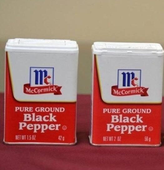
What Sparked the Pepper Dispute
The controversy began when McCormick adjusted the amount of pepper in one of its popular containers. The fill dropped by roughly a quarter, but the bottle kept its familiar size and shape. To many shoppers, it still looks like the same product they’ve always bought—even though there’s less inside.
Watkins argues that this creates a misleading shelf impression. McCormick’s opaque container hides the actual volume, while Watkins uses clear bottles that show exactly how much spice you’re getting. On a crowded shelf, a bigger-looking package can feel like a better deal, even when the contents are similar. According to Watkins, that visual edge nudges buyers toward McCormick and makes fair competition harder.
Continue reading on the next page…