
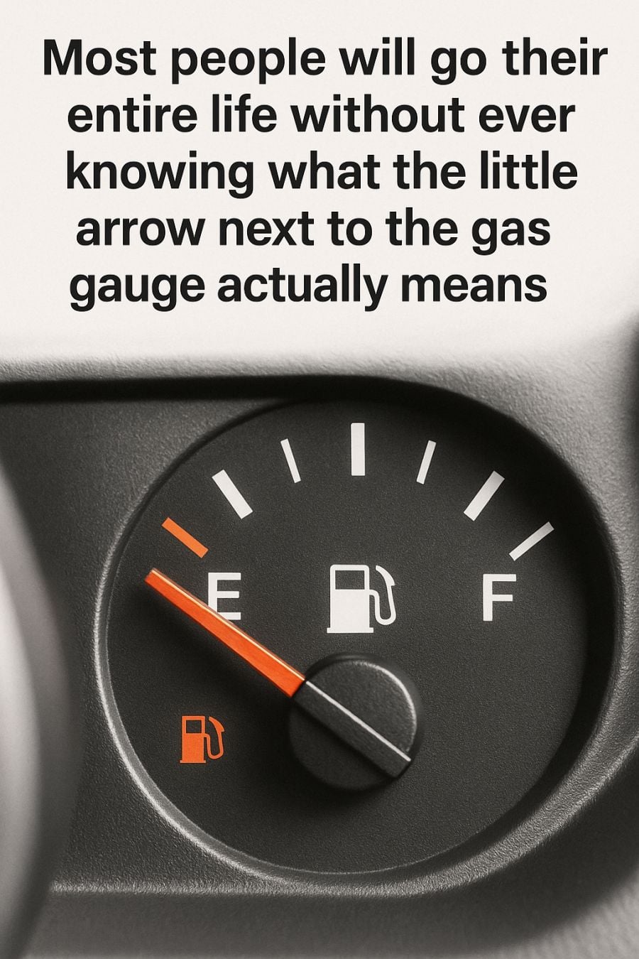
Most drivers glance at their dashboard every day without noticing one of its most practical features. Tucked beside the fuel pump icon is a small arrow—easy to miss, never blinking, and rarely explained. Despite its low profile, this symbol solves a common driving problem: knowing which side of your vehicle the fuel door is on.
The arrow points directly to the side where your gas cap is located. If it points left, the fuel door is on the left. If it points right, that’s where you’ll find it. This simple indicator removes the need for guessing, awkward repositioning at the pump, or pulling around twice while other drivers wait.
A Design Feature Built for Real Life
This small but effective detail wasn’t added by chance. As vehicle ownership patterns changed, drivers began using multiple cars more frequently—rental vehicles, shared family cars, work fleets, or borrowed rides. Relying on habit or memory no longer worked. Automakers responded with a universal visual cue that requires no explanation, no language, and no learning curve.
In moments when you’re distracted, tired, or running low on fuel in an unfamiliar area, that arrow becomes instantly useful. One quick glance tells you exactly how to line up at the pump, saving time and mental energy when you need it most.
Why the Arrow Is So Effective
What makes this feature stand out is its restraint. It doesn’t flash or demand attention. It’s always there, quietly doing its job. Once drivers understand what it means, it permanently changes how they approach refueling. After that, the absence of such a feature feels almost inconvenient by comparison.
This design reflects a larger trend in modern automotive engineering. Today’s dashboards are filled with subtle guidance systems rather than constant alerts. Temperature warnings, fuel efficiency indicators, and tire pressure notifications are designed to assist—not overwhelm—the driver. The fuel arrow fits neatly into this philosophy.
Small Convenience, Big Impact
The arrow doesn’t prevent major mechanical failures, but it eliminates repeated, everyday friction. And those small inconveniences add up. Reducing even one of them improves the overall driving experience more than most people realize.
Its usefulness is especially clear when driving away from home. On road trips or in rental cars, familiarity disappears. The arrow becomes a reliable constant. No matter the brand, model, or country, the symbol works the same way—making it one of the few truly universal elements of car dashboard design.
A Lesson in Thoughtful Design
There’s something reassuring about a car feature that helps without demanding attention. The arrow doesn’t correct you or call attention to mistakes. It simply points in the right direction. That kind of design respects the driver’s focus and reduces cognitive load.
Ironically, many drivers remain unaware of the arrow’s purpose—even after years of ownership. They continue relying on instinct and occasionally get it wrong. Once you notice the arrow and understand it, though, it becomes impossible to ignore.
Why We Often Miss the Most Helpful Features
The fuel arrow also highlights how easily subtle information gets overlooked. We’re conditioned to respond to alarms, warning lights, and notifications, but we often miss quiet cues. The arrow works precisely because it doesn’t compete for attention. It waits until you need it.
In an age of constant alerts and digital noise, that simplicity is refreshing. The fuel arrow doesn’t interrupt—it rewards awareness. And in doing so, it quietly removes an entire category of unnecessary frustration.
The Takeaway
Next time you’re in the driver’s seat, take a moment to look beyond speed and fuel level. Pay attention to the subtle symbols designed to make driving smoother and more efficient. That small arrow next to your gas gauge is proof that smart vehicle design doesn’t always shout.
Sometimes, the best automotive features are the ones that quietly save you time, stress, and just a little embarrassment at the gas station.