
In a fast-paced retail world, shoppers rarely pause to analyze every label. Most decisions happen in seconds, guided less by math and more by what looks familiar, substantial, or trustworthy at a glance. Packaging shape, size, and shelf presence quietly influence perception, especially in everyday purchases where habit replaces scrutiny. A recent legal dispute in the spice aisle shows just how powerful those subtle signals can be.
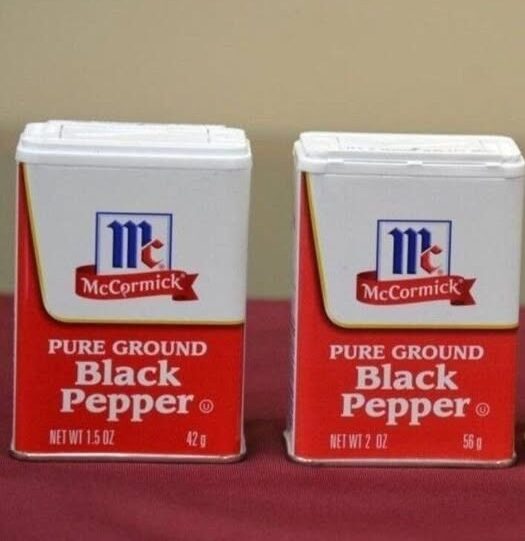
At the center of the case are McCormick & Company and smaller rival Watkins Incorporated. Watkins claims that McCormick reduced the amount of pepper in one of its best-selling containers—shrinking it from roughly eight ounces to closer to six—while keeping the external packaging nearly identical. According to the lawsuit, this visual consistency may lead shoppers to assume they are buying the same quantity they always have.
Visibility is a key point of contrast. Watkins sells its pepper in clear containers, allowing consumers to see exactly how much product they’re getting. McCormick’s containers, however, are opaque. When placed side by side on a shelf, McCormick’s packaging appears larger and more substantial, even when the actual quantity inside is comparable. Watkins argues that this creates an uneven playing field, where visual impact outweighs transparency.
Continue reading on the next page…